UI Engineering · Web Performance
By Séverine Baudrand.
How Screens Shape Front-End Performance: Density vs. Technology
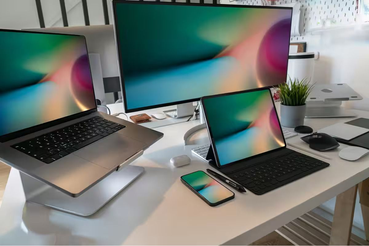
Retina, high PPI, DPR 2 and 3, Display P3, mini-LED and now OLED: the evolution of screens has changed how our interfaces look. Yet the subject is often explained with all the clarity of a badly burned pirate DVD menu. Density, DPR, PPI, Retina, subpixels: everything gets mixed together, and developers lose track of what actually affects front-end performance.
Spoiler: the panel label is not what makes your website heavy.
What changes the equation is pixel density and the way assets are prepared and delivered. An OLED panel does not, by itself, make your JavaScript slower. An image poorly prepared for a high-density display, however, can make an interface look blurry, heavy or unfinished.
Let’s separate the hardware, rendering, responsive images and energy questions to understand what really matters.
Essential concepts
- PPI: pixels per inch
- The number of physical pixels along one inch of a display. Higher PPI means a finer pixel grid. It is a hardware measurement, like screen size. A 5-inch Full HD display is approximately 440 PPI; a 27-inch 4K display is approximately 163 PPI. The same resolution can look very different on different-sized panels.
- DPI: dots per inch
- A term primarily associated with printing. It also appears in software scaling terminology, but should not be confused with a panel’s physical PPI.
- High density, or HiDPI
- A display configuration where several physical pixels represent one CSS pixel. Raster images need suitable resolution, vector assets are useful for logos and icons, and typography still needs careful attention.
- Retina
- Apple’s marketing term for high-resolution displays, not a panel technology or a fixed numerical ratio. Both LCD and OLED displays can carry the Retina name.
- Subpixels
- The colour-emitting or colour-filtering elements used to construct an image. Their arrangement varies between panels: an RGB stripe is only one possibility, and OLED layouts such as PenTile do not necessarily give every logical pixel its own identical RGB triplet.
- Subpixel rendering
- A text antialiasing technique that uses a display’s colour subpixels to refine letter edges. Whether it is used depends on the operating system, rendering path and display configuration. On dense screens, grayscale antialiasing can also produce crisp text.
- CSS pixel
- The reference unit browsers use for layout. At DPR 1, a CSS pixel can map to one device pixel; at DPR 2, it spans two along each axis. It is not permanently tied to one physical pixel. Display scaling and page zoom affect that relationship.
- DPR: devicePixelRatio
- The ratio of resolution in physical pixels to resolution in CSS pixels. Expressed as pixel sizes, it is the size of a CSS pixel divided by the size of a physical pixel. DPR can be fractional and can exceed 3. PPI alone does not determine it: operating-system scaling and browser zoom matter too.
- Colour gamut: sRGB and Display P3
- The range of colours a colour space or display can represent. Display P3 extends beyond sRGB, particularly in saturated reds and greens. Gamut, contrast and pixel density are separate properties.
- Resolution
- The number of pixels across and down, for example 1920 × 1080. Resolution alone does not describe perceived sharpness: Full HD on a 5-inch screen is much denser than Full HD on a 27-inch screen.
- Panel technology: LCD, mini-LED and OLED
- LCD uses a backlight; mini-LED is a backlight technology used with LCD panels. OLED pixels emit their own light. These differences affect contrast, appearance and energy use, but do not change a page’s HTML or downloaded bytes.
- Responsive images
srcset,sizes,<picture>and CSSimage-set()help a browser select an image appropriate to the rendered size, display density and supported formats.- Image formats
- AVIF and WebP offer useful raster compression options. SVG describes vector graphics. Choose according to the actual content and rendering cost, rather than treating one format as universally best.
What panel technology does not change
Changing from LCD to OLED does not inherently change:
- the number of bytes downloaded;
- the page’s JavaScript;
- the CSS rules or document structure;
- the layout expressed in CSS pixels.
Browsers do not expose a standard “this is an OLED panel” switch. What changes most visibly is the result: deeper blacks, potentially richer colours, and sometimes a different appearance of text edges.
That does not mean every screen has the same rendering cost. Resolution, refresh rate, GPU capabilities and the number of pixels painted can affect frame rendering. Those are distinct from the LCD or OLED label.
There is also an energy dimension. On OLED, black pixels emit no light. A darker interface can therefore reduce display power, but the saving depends on brightness, content, the panel and the rest of the device. It is not a fixed battery-life bonus. Purdue’s 2021 research illustrates how strongly brightness affects the result.
Density is where the asset problem becomes visible
High-density displays raise the standard for image preparation. A larger DPR means more physical pixels are available to display the same CSS-sized element. That makes the quality of the source asset particularly noticeable.
What dense screens expose:
- undersized images;
- blurry bitmap icons;
- fragile typography, especially thin strokes and poor contrast;
- banded gradients that feel like a nostalgic visit to Windows XP.
A dense display is a magnifying glass. And a magnifying glass is not very forgiving.
Asset management is the heart of the subject
The goal is conditional, efficient delivery without sacrificing the visual experience.
Images and DPR
For an image rendered at 100 × 100 CSS pixels, matching the physical pixel grid would require:
- DPR 2: 200 × 200 source pixels;
- DPR 3: 300 × 300 source pixels.
Without a larger candidate, a browser may upscale a smaller source and reveal softness. Upscaling does not itself create an extra network transfer. Conversely, automatically serving the largest possible image to everyone wastes bytes. The useful compromise depends on the content, compression, viewing conditions and measured visual quality.
For a flexible layout, width descriptors and an accurate sizes attribute let the browser make an informed choice. This example assumes the image occupies the full viewport up to 1200 CSS pixels, then stops growing. The dimensions and candidate files must match the real layout.
<picture>
  <source
    type="image/avif"
    srcset="hero-800.avif 800w,
            hero-1600.avif 1600w,
            hero-2400.avif 2400w"
    sizes="(min-width: 1200px) 1200px, 100vw">
  <source
    type="image/webp"
    srcset="hero-800.webp 800w,
            hero-1600.webp 1600w,
            hero-2400.webp 2400w"
    sizes="(min-width: 1200px) 1200px, 100vw">
  <img
    src="hero-800.jpg"
    srcset="hero-800.jpg 800w,
            hero-1600.jpg 1600w,
            hero-2400.jpg 2400w"
    sizes="(min-width: 1200px) 1200px, 100vw"
    width="1200" height="675"
    alt="A mountain ridge reflected in a lake"
    fetchpriority="high"
    decoding="async">
</picture>
This example is for a prominent hero image that may be the Largest Contentful Paint element, so it is not lazy-loaded. Use loading="lazy" for suitable images below the fold, not the LCP image. See web.dev’s responsive image guidance.
Art direction for more demanding layouts
Sometimes mobile and desktop need different crops, not merely different resolutions. Use <picture> to express that choice. The example below assumes a 1200 × 675 desktop crop and a 600 × 750 mobile crop, with appropriately sized source files. A 3600-pixel candidate is an option to measure, not an instruction to serve it everywhere.
<picture>
  <!-- Desktop crop, 16:9 -->
  <source media="(min-width: 1024px)"
    type="image/avif" width="1200" height="675"
    srcset="desktop-1200.avif 1200w,
            desktop-2400.avif 2400w,
            desktop-3600.avif 3600w"
    sizes="(min-width: 1200px) 1200px, 100vw">
  <source media="(min-width: 1024px)"
    type="image/webp" width="1200" height="675"
    srcset="desktop-1200.webp 1200w,
            desktop-2400.webp 2400w"
    sizes="(min-width: 1200px) 1200px, 100vw">
  <source media="(min-width: 1024px)"
    width="1200" height="675"
    srcset="desktop-1200.jpg 1200w,
            desktop-2400.jpg 2400w"
    sizes="(min-width: 1200px) 1200px, 100vw">

  <!-- Mobile crop, 4:5 -->
  <source type="image/avif"
    srcset="mobile-600.avif 600w,
            mobile-1200.avif 1200w,
            mobile-1800.avif 1800w"
    sizes="100vw">
  <source type="image/webp"
    srcset="mobile-600.webp 600w,
            mobile-1200.webp 1200w,
            mobile-1800.webp 1800w"
    sizes="100vw">
  <img src="mobile-600.jpg"
    srcset="mobile-600.jpg 600w,
            mobile-1200.jpg 1200w,
            mobile-1800.jpg 1800w"
    sizes="100vw"
    width="600" height="750"
    alt="A mountain ridge reflected in a lake"
    fetchpriority="high" decoding="async">
</picture>
Descriptive alternative text should reflect the actual image and its purpose. Replace these illustrative filenames and descriptions with real assets.
Know your formats
- AVIF: useful compression and wide-gamut support; compare output quality, file size and decoding cost.
- WebP: a widely supported option for photographs and transparency.
- JPEG: still useful for photographs and as a fallback where the target audience needs one.
- PNG: useful when lossless raster detail is required. Transparency alone does not make it the best choice.
- SVG: usually a good fit for logos and icons. Keep the markup and effects simple.
- Lottie: useful for some vector animations, but not automatically lighter than video or CSS. Measure the asset, runtime and rendering work, and respect reduced-motion preferences.
Text and subpixels
HiDPI changes how text is rasterised, but does not remove the need for readable typography. Check:
- the actual font on the devices you support;
- sufficient contrast;
- comfortable text sizes;
- thin strokes, especially on displays where the subpixel arrangement makes their edges less predictable.
For a typography scale, rem and em can help respect a user’s preferred base font size. CSS px values do scale with normal browser page zoom; they are not physical pixels frozen on the panel. Relative units are useful, but neither unit choice alone guarantees accessibility. Test zoom, text enlargement, reflow and clipping.
Display P3: a wider palette, handled carefully
The web has historically relied on sRGB. Some modern displays support a wider gamut, including Display P3, which allows colours outside sRGB. This matters when the accuracy and intensity of colour are central to a photograph or brand.
A correctly colour-managed sRGB image should retain its intended colours on a P3 display; it does not become defective simply because the display can show more colours. A P3 asset also does not automatically become heavier: dimensions, compression, bit depth and content all matter.
For colour-sensitive work, keep export settings and embedded profiles under control, compare the actual output, and provide suitable behaviour on narrower-gamut displays. AVIF can carry the necessary colour information, but the format alone does not fix an inconsistent colour workflow.
My practical rule: use a wider gamut when it serves the image and design intent. Keep an sRGB workflow when that already meets the brief. Luxury, photography and premium branding can justify extra attention, not unlimited bytes.
Does DPR stop at 3?
No. There is no universal DPR 3 ceiling. Device scaling and browser zoom can produce higher or fractional values. A pipeline should not assume that 1, 2 and 3 are the only possible numbers. MDN documents how devicePixelRatio works, including the effect of page zoom.
The useful question is how much source resolution actually improves this image at its intended viewing size.
- Perception: extra pixels can bring diminishing visible returns, depending on viewing distance and content.
- Cost: pixel count grows with the square of the ratio. A 1000 × 1000 CSS-pixel image maps to 9 million physical pixels at DPR 3 and 16 million at DPR 4. File size does not necessarily scale by that exact factor.
- Delivery: sensible candidates, accurate layout information and measurement are more useful than producing every theoretical resolution.
Supporting common densities well is a practical goal. Treating 3x as the end of the road is not a reliable technical assumption.
Which screens do people actually use?
There is no single screen profile for “the web”. Phones often combine high density with small CSS viewports; desktop displays vary widely in size, resolution, colour gamut and operating-system scaling. External monitors make assumptions based on a computer brand especially unreliable.
Avoid treating all Android phones as DPR 2, all Windows displays as DPR 1, or every Apple setup as P3 and HiDPI. Base the test matrix on the project’s audience where you have evidence, and keep sensible fallbacks for everyone else.
In practice, test a mixture of viewport sizes and densities. Verify colour-critical work on a suitable display, while making sure the experience remains coherent on an ordinary sRGB screen.
OLED and high density: design ambition meets front-end discipline
Modern displays encourage us to pay attention to contrast, typography, gradients, shadows and the quality of assets. OLED adds an energy consideration to theme design, alongside readability and user preference.
The evolution of screens is therefore an asset, density and colour-management problem:
- density calls for better-prepared images;
- wide gamut calls for a controlled colour workflow;
- responsive delivery calls for an accurate asset pipeline;
- OLED invites us to consider the energy implications of the visual design.
We need a workable balance between the art director asking for sumptuous, often enormous visuals because “the pixel is a noble material”, and the front-end developer trying to stop those same images crushing performance like a mammoth sitting on a 4G modem.
A luxury project may justify higher-resolution imagery and a wider gamut to serve its visual identity. The front-end task is to make that ambition work through precise responsive delivery, good cropping, well-chosen formats and careful typography. Even then, weight needs a budget and the result needs measurement.
For a simpler project, keep the pipeline proportionate: restrained assets, sufficient resolution and a colour workflow that serves the content. Do not create a museum demonstration when a clear, efficient interface is what people need.
Good practices at a glance
| Subject | Good practice | Why | Avoid |
|---|---|---|---|
| Raster images | Provide useful size candidates through srcset. | Balance sharpness and transferred bytes. | One oversized image for everyone. |
| Responsive images | Use accurate sizes with width descriptors; use picture when format or crop selection needs it. | Give the browser the right layout information. | Resource sizes unrelated to the rendered image. |
| Formats | Compare AVIF, WebP and other appropriate exports. | Optimise actual quality and size. | Choosing solely by extension. |
| Logos and icons | Prefer simple SVG where appropriate. | Scale cleanly without a bitmap for every density. | Blurry 1x icons or unnecessarily complex vectors. |
| Animation | Compare CSS, video and vector approaches; support reduced motion. | Control bytes and rendering work. | Assuming Lottie is always the lightest choice. |
| CSS backgrounds | Consider image-set() for density variants. | Offer suitable resources. | A stretched 1x background. |
| P3 and sRGB | Preserve colour profiles and test the output. | Keep the visual intent coherent. | Using wide gamut without checking the workflow. |
| Typography | Check contrast, size, zoom and actual font rendering. | Keep text readable across devices. | Thin, low-contrast text and clipped enlarged content. |
| OLED themes | Offer a readable dark theme where useful. | May reduce display power depending on conditions. | Promising a universal battery saving. |
| LCP image | Set a measured size budget and load the critical image promptly. | Improve perceived loading and LCP. | Lazy-loading the hero or treating 150-200 KB as a universal guarantee. |
| Fallbacks | Match format support to your browser requirements. | Keep images available to the intended audience. | Assuming a fixed fallback chain guarantees every situation. |
| Premium projects | Use extra visual fidelity selectively, with responsive delivery. | Preserve the design without uncontrolled cost. | Delivering the heaviest export to everyone. |
| Simpler projects | Keep sizes, formats and the pipeline proportionate. | Reduce unnecessary complexity. | Assuming DPR 1 or 2 is always enough for every image. |
References
- MDN: Window.devicePixelRatio
- W3C: CSS values and absolute length units
- International Color Consortium: Display P3
- AOMedia: AVIF image format specification
- W3C: CSS Images Module Level 4
- web.dev: responsive images
- web.dev: optimise Largest Contentful Paint
- Purdue University (2021): dark mode and OLED power consumption